
Is your business losing money because your website is not optimized for the mobile web? Count on it!
You might think that just because you can load your website on a mobile device, that your site is optimized for the mobile web. Unfortunately, nothing could be further from the truth. If you can’t view and read your website text when it first opens without touching the screen to zoom in and scroll in all different directions, then your site is not a mobile website.
Imagine sitting at home or your office in front of your desktop PC or laptop and you have to reach over and touch your computer monitor to zoom in and scroll everywhere just to view your website… That would be ridiculously inconvenient, don’t you think? Then why should your customers have to be subjected to that kind of frustration on their mobile devices?
Your website in its current state, was not designed for the smaller screens of mobile devices. Fonts are going to be too small and impossible to read, images are too large and bog down loading times, website coding is formatted in such a way, that it doesn’t automatically adapt to the small screens a Blackberry, Droid, iPhone, iPad, and dozens of other tablets and mobile devices. And if your site has ANY Flash animation elements, it is rendered completely useless to any of the millions of iPhone and iPad users. Steve Jobs has stated on Apple’s website in an article entitled “Thoughts on Flash“, “Most Flash websites will need to be rewritten to support touch-based devices.” Although, I’m not sure why he would use the word “most” because the fact of the matter is, that all sites with Flash elements will need to be rewritten in order to be viewed on a mobile device. There’s just no way around it.
Why You Need a Mobile Website:
- 60 million US subscribers access the mobile web each day
- Mobile phones currently outnumber home computers 4 to 1
- More than 50% of consumers are unlikely to return to your site if they have a poor mobile experience.
- People who access the mobile web are projected to surpass home based Internet use by 2014
- Google has reported a 400% increase in mobile searches over the course of 1 year. One of every three of those searches is for local businesses.
- Websites built using Flash animation are rendered completely useless to anyone with an iPhone or iPad as Apple refuses to allow their devices to read Flash elements. This will not change in the future.
- iPad sales went from 300,000 to nearly 15 million in less than one year.
- iPhone sales went from 3.7 million to over 100 million units in just three years.
- The amount of mobile web traffic is expected to increase 40X over the next 5 years.
- Approximately 40-50% of local business Internet traffic is coming from mobile devices and is growing rapidly.
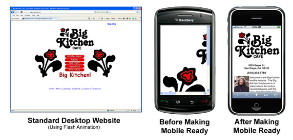
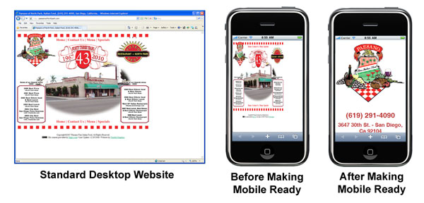
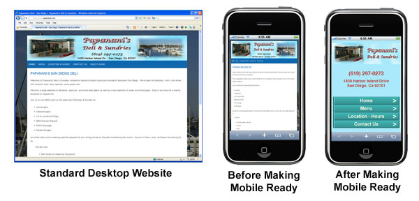
If you think the mobile web is the thing of the future, think again. The mobile web is NOW… and you’re business needs to catch up! If you haven’t noticed, many of the largest corporations have jumped into making their website content available on a mobile website. Aside from Facebook, Amazon, and eBay, just to name a few, look at the example of Dominos Pizza below. As you can see on the “standard” website, it would be impossible to read that text without touching the screen and zooming in. Doing so, eliminates your ability to see the rest of the page and is difficult to manage. Look at the navigation links at the top of the page. Again, without zooming in and scrolling from side to side, you’re not likely going to be able to find or hit the navigation link that you want.
Now look at the “Mobile Website” on the left. There’s one, easily identifiable header image and 5 easy to read, large, navigation links to tap on without having to zoom or scroll! Each of those links goes to another page that’s easy to read with only vertical scrolling to read up and down the page. Mobile websites are not just for big companies. It just so happens that they have a staff of people to keep their sites and technology as up to the minute as possible. Your customers would much rather view a site like this and are much more likely to do business with a site that they can easily read and navigate. Where’s your tech staff to keep your technology up to the minute?

Look how easy it is to view and navigate a mobile website. Your customers will notice!
Creative Outsource Group can inexpensively build a mobile optimized website that compliments your primary website. We’ll also code your standard website to automatically recognize what sort of device is trying to access it. If your Internet visitor is visiting your site from their home desktop or laptop computer, they will be served your standard website. If they are visiting from a mobile device such as a Blackberry, iPhone, iPad, Droid, etc…, they will be automatically redirected to your mobile website. The experience for your customer is seamless and there is absolutely no visual impact on your standard website.
Again, the mobile web and your need for a mobile website is not coming… it’s here! Take a look at a few examples of mobile optimized websites that we’ve completed.